
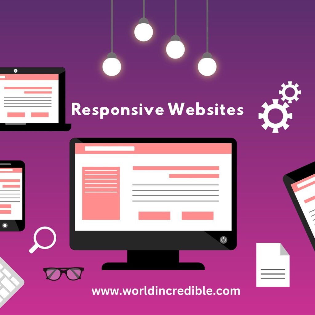
In today’s digital age, where consumers rely heavily on their mobile devices, it has become essential for businesses to create websites that provide a seamless user experience across different devices and screen sizes. This is where responsive web design comes into play. Responsive websites adapt and adjust their layout, content, and functionality to provide an optimal viewing experience, regardless of whether the user is accessing the site on a desktop, tablet, or smartphone. In this article, we will explore the concept of responsive web design, its benefits, and how it can unleash the potential of user experience.
Understanding Responsive Web Design
Responsive web design is an approach to web development that aims to create websites that respond to the user’s behavior and environment, based on screen size, platform, and orientation. It involves using flexible grids and layouts, fluid images, and CSS media queries to ensure that the website adapts and scales seamlessly to fit any screen resolution.
Benefits of Responsive Web Design
Enhanced User Experience:
- The primary goal of responsive web design is to provide users with a consistent and optimized experience across all devices. By adapting to different screen sizes, responsive websites ensure that users can easily navigate and interact with the content, leading to higher engagement and satisfaction.
Improved Accessibility:
Responsive design also promotes accessibility, making websites more inclusive for users with disabilities. By accommodating various devices and assistive technologies, responsive websites ensure that everyone can access the information and functionality they need, regardless of their abilities.
Cost and Time Efficiency:
In the past, businesses had to create separate versions of their websites for desktop and mobile devices. This meant additional development time, resources, and maintenance efforts. With responsive design, a single website can cater to all devices, reducing costs and saving time.
Search Engine Optimization (SEO):
Responsive websites are favored by search engines like Google because they provide a consistent URL structure and content across all devices. This makes it easier for search engine crawlers to index and rank the site, resulting in better visibility and higher organic traffic.
Future-Proofing:
With the ever-increasing variety of devices and screen sizes, responsive web design future-proofs your website. As new devices emerge, your responsive website will automatically adapt, ensuring that your users always have a seamless experience.
Unleashing the Potential of User Experience
- Consistent Branding: Responsive web design allows businesses to maintain consistent branding across all devices. Users should be able to recognize and associate your brand with a positive experience, regardless of the device they use to access your website. Consistency in design, colors, and messaging builds trust and loyalty among users.
- Streamlined Navigation: Responsive websites often feature simplified navigation menus, ensuring that users can easily find what they are looking for. By prioritizing the most critical content and streamlining the user journey, responsive design minimizes friction and increases conversion rates.
- Engaging Visuals: Responsive web design allows for dynamic and visually appealing content that adapts to different screens. By optimizing images, videos, and interactive elements, you can create an engaging and immersive experience for users, capturing their attention and encouraging them to explore more.
- Faster Page Load Times: Responsive websites are designed to load quickly on any device, which is crucial for user satisfaction and retention. With faster load times, users are less likely to abandon the site and more likely to engage with its content, ultimately leading to higher conversion rates.
- Social Media Integration: Social media is an integral part of our daily lives, and responsive design ensures seamless integration with various social media platforms. Users can easily share your content, follow your brand, and interact with your social profiles, amplifying your online presence and reach.
Conclusion:
Responsive web design has become a necessity in today’s digital landscape. With the increasing use of mobile devices and diverse screen sizes, businesses need to prioritize providing a seamless user experience across all platforms. By adopting responsive web design principles, businesses can unlock the full potential of user experience and reap numerous benefits.
Responsive websites enhance user experience by adapting to different devices and screen resolutions, ensuring that users can navigate and interact with the content effortlessly. This leads to increased engagement, satisfaction, and ultimately, higher conversion rates. Additionally, responsive design promotes accessibility, making websites inclusive for users with disabilities.
From a business perspective, responsive web design offers cost and time efficiencies. With a single website that caters to all devices, businesses can save development resources and maintenance efforts. Furthermore, search engines favor responsive websites, leading to improved search engine rankings and organic traffic.
Unleashing the potential of user experience through responsive design involves maintaining consistent branding, streamlining navigation, utilizing engaging visuals, optimizing page load times, and integrating social media seamlessly. By prioritizing these aspects, businesses can create a cohesive and immersive experience for users, fostering brand loyalty and amplifying their online presence.
In conclusion, responsive web design is a powerful tool for businesses to deliver an exceptional user experience and stay ahead in the digital landscape. Embracing responsive design principles not only benefits users but also leads to increased conversions, improved search engine visibility, and future-proofing your online presence. By unleashing the potential of responsive websites, businesses can forge stronger connections with their target audience and drive success in the ever-evolving digital world.